Colour is one of the easiest ways you can communicate meaning. I will be helping explain this in today’s Frank Zweegers art blog. In both figurative and abstract painting, colour can be used for its decorative beauty, to create mood and to express an emotion. In nature and in art, colour has a profound effect on the viewer.
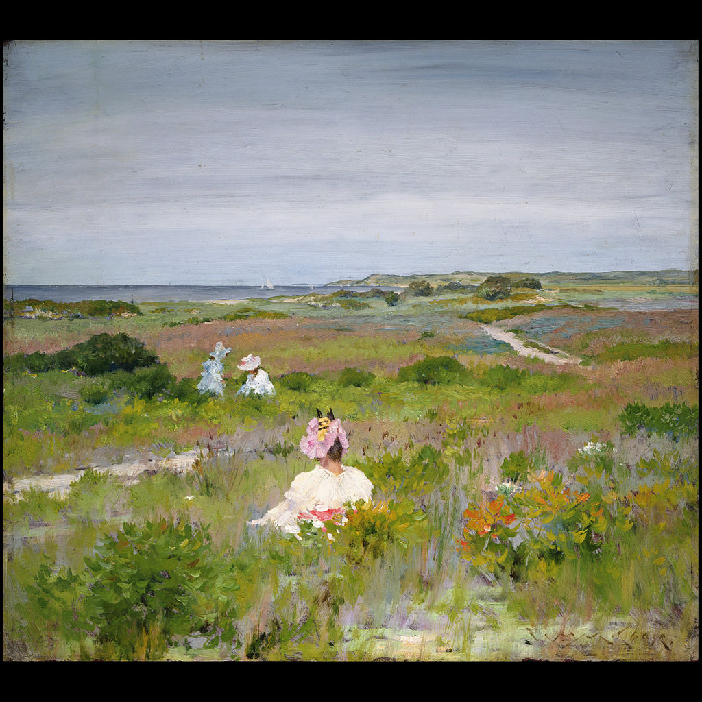
We can create mood in art by thinking of the colours we associate with certain tones. Most typically, bright, warm colours such as rich yellows, oranges, pinks and autumnal colours create a feeling of warmth and happiness within art. Whereas colours such as blues, greens and purples can create a feeling of sorrow and sadness. Although when thinking of colour and association, you shouldn’t think rudimentary when thinking of what a colour means. I always explain to my students within my Frank Zweegers art class, that colours can have multiple meanings. For example, when thinking of the colour blue again, it can also be used to create a soothing and relaxing atmosphere. Many artists also use light blue tones to create the feeling of calm and relaxation, or playing with tone, create a cool and frosty effect. It can also create the feeling of depth and space within a painting.
Many artists such as Henri Matisse have experimented with the use of colour, switching it from traditional formats to more impressionist and alternative forms. For example, grass doesn’t have to be green and the sky doesn’t have to be blue. The real beauty of art is that you can create and colour the world as you want.
You should think about the colour wheel when studying or creating art. The colour wheel shows different variations of the main primary colours (red, yellow and blue) by mixing and contrasting them. By referring to this colour wheel, you can see which colours complement each other, and what colours make each other seem dull, or take away the affect that colour can have on the viewer. The technique in which you apply colour, can also alter the affect that the colours have within your work. Blending colours, such as pastels and light tones and create a harmonious feeling, this is commonly used in artists work such as Monet. This is an excellent technique for creating scenes of nature or landscapes. On the other hand, using blocks of colour, monotone and non-blended shades creates a harshness, which grabs the audience’s eye it creates a restlessness in the viewer. If there is only thing you take away from this Frank Zweegers blog post, it should be that you should always pay attention to colour within art.